Why are UX and UI a business issue, not just an aesthetic one?
It is tempting to view design as merely a visual layer added at the end of a project. However, it is one of the most cost-effective levers in software development. IBM has estimated that fixing a usability issue in production can cost up to 100 times more than resolving it during the design phase.
In B2B software, the impact is immediate. A few seconds wasted on a task performed every day quickly add up to hours of work across an entire team. A confusing interface leads to more errors, slows down operations, and makes it harder to train new users. Ultimately, it’s not just the users who suffer the consequences, but the entire organization.
Conversely, good UX/UI design yields tangible results:
- Reduced training time: According to the Nielsen Norman Group, a well-designed interface can reduce the learning curve by 40% to 60%.
- Fewer operational errors: A clear visual hierarchy and well-placed confirmations significantly reduce handling errors.
- Fewer support requests: Self-sufficient users place less demand on IT and help desk teams.
- Faster adoption: Teams are more likely to embrace a tool they find intuitive, which speeds up the solution’s return on investment.
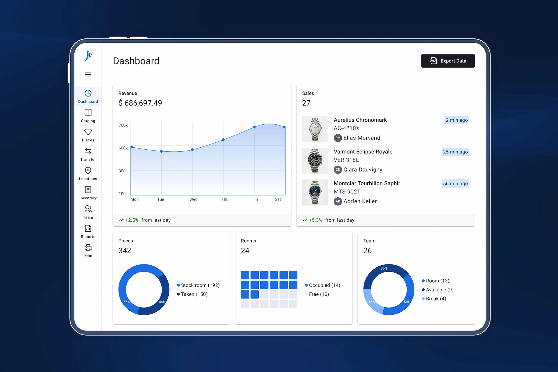
At Solid, these benefits are clearly evident in practice. Every interface improvement translates into measurable time savings on tasks that are sometimes repeated dozens of times a day.
B2B software has its own design constraints
Designing a B2B interface does not follow the same rules as a consumer app. Users are professionals who perform specific, repetitive tasks, often under demanding conditions such as in warehouses, on the go, or under time pressure, etc.
This requires specific design choices:
- Controlled information density: Professionals need access to a large amount of relevant data, sometimes all on a single screen, but without causing cognitive overload.
- Functionality over aesthetics: every interaction should require as few steps as possible, following a predictable and repeatable logic.
- System status transparency: Users must know at all times what is happening—whether the system is loading, an action is in progress, an error has been detected, or the connection is active or lost.
- Confirmations for critical actions: Some actions are irreversible, so it is essential to incorporate clear safeguards into the interface without slowing down the workflow.
- Handling edge cases: empty results, resource not found, connection loss—each exception scenario must be considered and addressed visually.
Our solutions take these constraints into particular account. For example: an operator attaching an RFID tag to an asset doesn’t have time to switch between multiple screens. They need an interface that gets straight to the point, displays the right information at the right time, and prevents them from making an irreversible mistake without clearly warning them. These aren’t just minor details; they are the foundation of a tool that teams sometimes use for several hours a day.
Our design process: from concept to development
Step 1 - Scope & Understanding
Before we begin designing, we define the scope of the functionality: challenges, objectives, target users, and integration into existing workflows. This step also involves coordinating with stakeholders (product managers, IT, business units, developers) to ensure a shared vision.
Step 2 - Field Research & Understanding
We analyze users and business processes through interviews and an assessment of the current system. The goal is to understand actual usage patterns, on-the-ground constraints, and pain points in order to create a design tailored to the operational context.
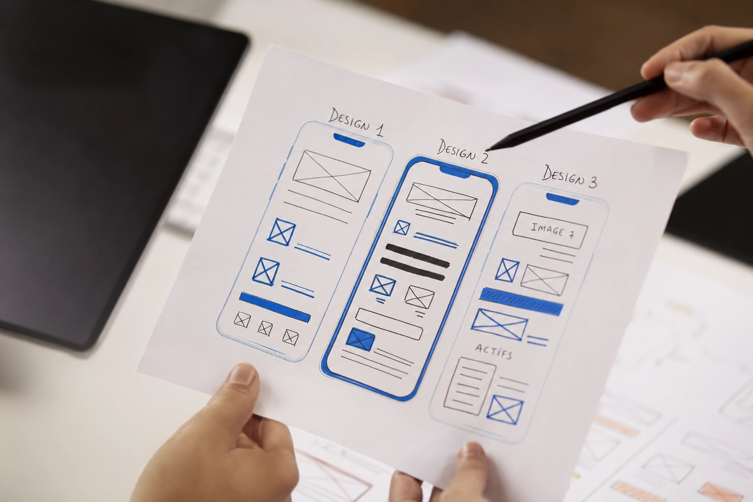
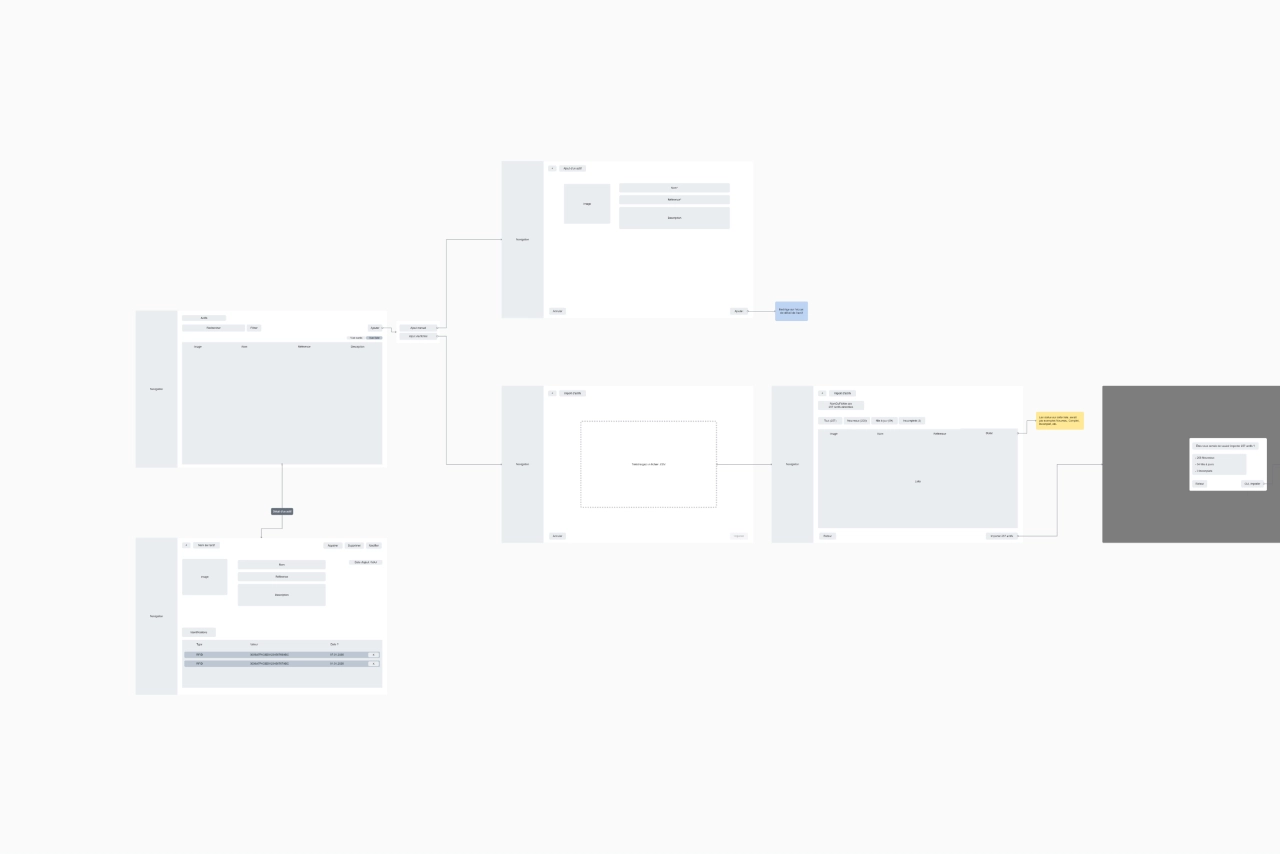
Step 3 - Wireframing
Before working on the interface, we usually go through a wireframing phase, creating black-and-white functional diagrams that serve as a blueprint or skeleton. Their purpose is to define the structure, content, placement of elements, and user experience (UX) without worrying about the final design (colors, images, etc.).
It is during this phase that key UX questions are addressed:
- In what order should the information be displayed?
- How many steps are involved in completing a task?
- What happens if a user makes a mistake?
In the process of designing and improving our solutions, this phase is critical: it allows us to anticipate on-site workflows even before the detailed design phase begins.
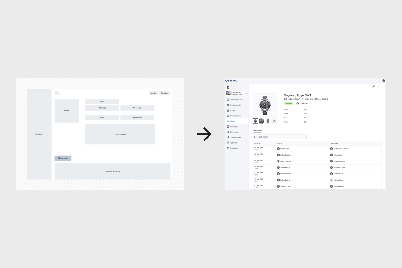
Step 4 - UI Design Using the Solid Design System
Once the structure has been approved, we move on to the visual design phase in Figma, using our design system as a guide.
This is a library of reusable components (buttons, tables, forms, icons, typography, colors, etc.) that serves as the common foundation for all our solutions.
Using a design system to develop solutions is essential today; it ensures:
- Visual consistency: All screens share the same visual style, ensuring consistent cues across our various solutions and features.
- Time savings: Existing components are reused directly and are also developed identically on the developers' side, eliminating the need to start from scratch for each feature.
- Controlled evolution: Any improvement to a component can be easily propagated across all interfaces where it is used, ensuring long-term consistency.
Step 5 - Development
Once the UI mockups are complete, they are sent to the development team.
Most of our solutions are developed using Flutter, a framework created by Google that allows us to maintain a unified codebase across all platforms—including mobile, web, and desktop applications. At the same time, the back-end development team handles the business logic, data management, and API exposure necessary for the feature to function properly.
Step 6 - Delivery & Continuous Iteration
Once the feature has been developed, it is deployed to production and monitored over time.
Analyzing usage patterns and user feedback helps identify areas for continuous improvement, as part of an iterative product development process.
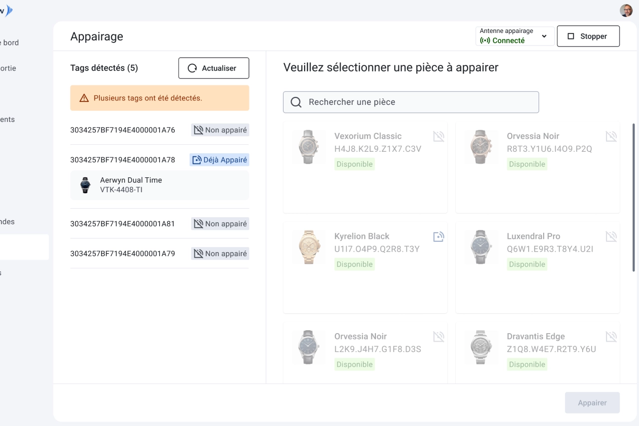
A concrete example: our redesign of the RFID pairing feature
Theory is good. A real-life example is better.
In a traceability solution, tagging is a key process: it involves linking a physical RFID tag to an asset recorded in the system. This is a critical step, as any error compromises the integrity of downstream data.
In the previous version of this feature, the workflow required several steps across different screens. After analyzing how it was used in practice, we completely redesigned the interface :
- Unified screen: RFID tags detected in real time and the list of assets to be associated are now displayed side by side on a single screen; the operator can scan, select, and confirm without leaving the view.
- Capture Point Status Indicator: Continuously displays the connection status to the RFID reader, allowing you to switch capture points with just a few clicks without leaving the workflow.
- Enhanced confirmation window: Before confirming, the user sees a summary of the selected asset's information—a security measure that prevents mismatches.
The result is significant time savings on a task performed repeatedly, and a measurable reduction in errors. This is what any good UX/UI work should achieve in a B2B solution, regardless of the industry.
Curious to see our interfaces in action? [cta|Request a demo|/contact]
Why evaluate UX/UI when choosing a B2B solution?
When a company evaluates a B2B solution, it typically looks at features, security, price, and technical integration. The user interface is often evaluated last—sometimes even after the contract has been signed. That’s a mistake.
In traceability solutions, these shortcomings have a direct operational cost: a wrong association, misread information, or an ignored status—and data integrity is compromised. At Solid, the UX/UI quality of our interfaces is designed to prevent this from happening.
A tool that your teams use every day should be designed with them in mind, not just for the sales demo.
Are you looking for a traceability solution designed for your field teams?[cta|Contact a Solid expert|/contact]
.webp)